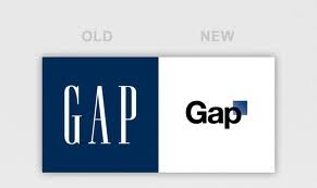
The consumers or brand fans most of the time accept change of logo as a mark of change, yet sometimes they fail to react positively. Result – like GAP , the brand has to resurrect the old logo. PepsiCo's Tropicana re-branding expedition had also met with a similar fate.
The reaction and involvement of brand followers of GAP on internet through face book and twitter opened a new avenue to involve consumers in the brand. Airtel tried this by inviting them to name the logo like Nike's Swoosh and Michelin's Bibendum.
The logo is the first identity that comes across the consumers. It is the face of the company. Hence, rebranding it has its own dangers. Still, the marketers have to do it some times. The reasons can be:
1. A need to inject vitality and youthfulness in to the brand (the colour in the Godrej logo).
2. Make it contemporary and more importantly connectable (Café Coffee Day's dialogue box logo);

3. Diversification and brand extensions (Starbucks removed the word coffee from its logo),
4. Expansions into new geographies (Airtel, Mahindra & Mahindra),
5. A change in the strategy of company.(Dell, American Express and Arvind)
6. Ventures in to new businesses (Videocon) and
7. In some cases re-branding happens when companies' try to draw attention.
The iconic Apple logo didn't always have bite. The first logo depicted Sir Isaac Newton under an apple tree. The changed identity may not find immediate acceptance by all. If it is well thought off and connect connects with the consumers then it becomes an integral part, like the current logo of Apple.
According to Young Kim, creative director, Siegel+Gale, "Re-branding is not just about changing a logo. It has to be strategic." Re-branding fails if enough time has not been spent on planning and communicating the reason for the change, both internally and externally.
Some companies use a rebranding exercise as a catalyst to refresh their manifesto, recharge their employees and boost trade sentiments. Such initiatives unless supported by deeper intent which has to be long-term impact on product, promise and experience — would come through as superficial changes which do not have any enduring values.
Indian companies see the logo as a quick fix. They want to be more contemporary, cooler and youthful. But they do not go through real transformation to change the culture and align the organisation to support what the logo is meant to convey.
A logo is the ultimate and most visible manifestation of a brand, the picture that is supposed to say a thousand words, and evoke a thousand conversations conducive for the brand's existence, acceptance and growth.
The logo is an influential branding instrument and can turn on a range of human emotions. But a logo change is certainly no more a private affair, it needs a lot of research.
First, correctly estimate the equity in a pre-existing logo, and sometimes go as far as looking at the different parts of the identity in isolation and decide which parts still have relevance and which do not.
Understanding and developing a logo is both art and Science.
• The art of a logo is about the personality reflected through iconology, colour, fonts, shapes spaces within. The art is in the feeling and emotion and surprise associated with a mark.
• The science is about reflecting facts, logic & messaging. The science behind the development of a logo is part research — the mark needed to create an impact and also part design, to shape an idea in a distinctive way.
Both have to work in tandem — and in sync to work for the brand. It can be as simple as a unique colour, type treatment, or even a symbol. But this must be applied in context with the audience's culture.

The two successful transformations have been of the Café Coffee Day and British Petroleum (BP). Café Coffee Day  changed its logo to an open dialogue box to position itself to a social hub. British Petroleum (BP) for example understood that using the colours of green and yellow would signal environmental sustainability and help change the perception of the company.
The colour of the logo plays an important part both in its appeal and communication. Each colour has its own significance.
1. Yellow and black is the most readable (scientifically proven) combination — highway signs are done in this combination mostly.
2. Blue is vast, calming, and relaxing and is known to create a connect with expertise, precision, technology and efficacy, hence brands in blue are likely to become believable quickly.
3. Pink and orange evoke certain taste-buds and are generally great for creating a multi-sensorial experience just through colour.
 |
| Old Airtel Logo |
4. Red colour is supposed to be exciting, aggressive, and passionate and therefore evokes a subconscious emotional response from the viewer. Red stimulates and engages the most.
The colours keep changing as brands and markets evolve. So when the over 110 years old brand Godrej decides to add vigour to itself, they kept the logo intact and added colour — Green for Harmony, Blue for the imagination and technology and Ruby for Passion and Dynamism.
But as far as branding is concerned the king of all colours is Red. A brand in red has the advantage of being noticed and registered in the minds of receivers. But, if the brand fails to create distinction in form or shape (or typography), it would get lost in the red ocean. Red needs black or white to contain it and create distinction.
Other Related Posts
Total Marketing Orientation
Functions of Chief Marketing Officer
Todays Dynamic Work Place
Other Related Posts
Total Marketing Orientation
Functions of Chief Marketing Officer
Todays Dynamic Work Place
No comments:
Post a Comment